WooCommerce sticky add-to-cart bar: keep the buy button visible
By Mariusz Szatkowski · Updated: 2026-09-11
On a long WooCommerce product page, the add-to-cart button is often the first thing to scroll off the screen. By the time a shopper has read the description, checked the gallery, scanned a spec table and skimmed the reviews, the price and the buy button are far above the fold. The shopper has done all the work of deciding, and then the page asks them to do a little more: scroll back up to act on it. A sticky add-to-cart bar closes that gap by keeping the price and button in reach for the whole visit. This guide explains what the feature is, why it helps a store, what a good implementation needs, and how the free Anchor plugin adds one to WooCommerce.
What a sticky add-to-cart bar is
A sticky add-to-cart bar is a slim, fixed strip that keeps a product’s price and buy button visible while the shopper scrolls.
It usually sits at the bottom of the single product page and shows three things: the product title, the current price, and an add-to-cart button. The word that matters is fixed. Because the bar is pinned to the viewport rather than to a position in the document, it travels with the shopper instead of disappearing upward as they read. Wherever they are on the page, the bar is in the same place at the bottom of the window.
The point is simple. The main add-to-cart area near the top of the page is perfectly good while it is on screen, but it stops being useful the moment the shopper scrolls past it. From that point on, the buy button exists but is unreachable without scrolling back. The sticky bar is a second, always-present copy of the one control that matters most, so the purchase decision can always be acted on the instant it is made.
It is worth being clear about what the bar is not. It is not a replacement for the main product form, and it is not a popup or an interstitial that interrupts the shopper. It is a quiet, secondary surface that only steps in when the primary one has left the screen.
Why it helps a store
The bar removes a small but real friction point: having to scroll back up to buy. That friction sounds trivial, and on a single page it is, but it lands on exactly the pages where the stakes are highest, and a fraction of shoppers abandon at every extra step you ask of them. Reducing the step tends to help most in four situations.
- Long pages. Detailed descriptions, spec tables, image galleries and review sections push the buy button far up the page. By the time a shopper reaches the bottom they may be several screens away from it. The bar keeps it within a single tap or click.
- Mobile shopping. Phone screens are short and scrolling is constant, so the main button leaves view almost immediately. A pinned bar is especially valuable here, where the gap between “I want this” and “where is the button” is widest.
- Considered purchases. When a shopper reads carefully before deciding, the moment they decide is the moment to capture. If acting on that decision requires hunting for the button again, you have introduced a pause in which they can be distracted, interrupted or have second thoughts.
- Variable products. Shoppers compare options and prices as they scroll. A bar that reflects the selected variation keeps the relevant price and the right button in front of them, so the comparison and the purchase happen in the same place.
None of this guarantees a higher conversion rate; plenty of factors decide whether a visit becomes an order. But keeping the buy button reachable is a low-cost, low-risk change, and it removes a friction point that you can otherwise only fix by making every product page shorter.
What a good sticky bar needs
Not every implementation is equal, and a sticky bar done badly is worse than none at all: a bar that shifts the layout, blocks rendering or covers content will cost you more than the friction it removes. Use this as a checklist whether you build, buy or install.
Warning: A sticky bar done badly is worse than none at all. One that shifts the layout, blocks rendering or covers content will cost you more than the friction it removes.
- No layout shift. The bar should be fixed to the viewport and start hidden, so revealing it does not push other content around or hurt your Cumulative Layout Shift score. A bar that occupies document flow and then appears is a Core Web Vitals problem.
- Lightweight, scoped loading. Its stylesheet and script should load only on single product pages, not site-wide, and the script should be deferred so it does not block the page from rendering.
- Variation awareness. On variable products the bar should follow WooCommerce’s native variations form, updating the price, stock status and buy button as options change, rather than showing a stale “from” price.
- A sensible trigger. The bar should appear once the shopper has scrolled past the main button, so it fills in only for the control that has left the screen. A configurable threshold lets you tune that distance to your template.
- Accessibility. Look for an ARIA region with a screen-reader label, a visible focus state, and respect for the
prefers-reduced-motionsetting so the entrance animation can be turned off. - Clean data handling. A focused tool stores a couple of settings and nothing per-product, keeps autoload off, and removes its data when you delete it. It should not phone home or load assets from a third-party CDN.
How Anchor does it
Anchor - Sticky Add to Cart Bar is a free, open-source plugin that adds exactly this: a slim sticky add-to-cart bar at the bottom of WooCommerce single product pages. It stays hidden until the shopper scrolls past the main add-to-cart button, then slides into view showing the product title, the current price and a buy button, so the add-to-cart control is still reachable on long pages.
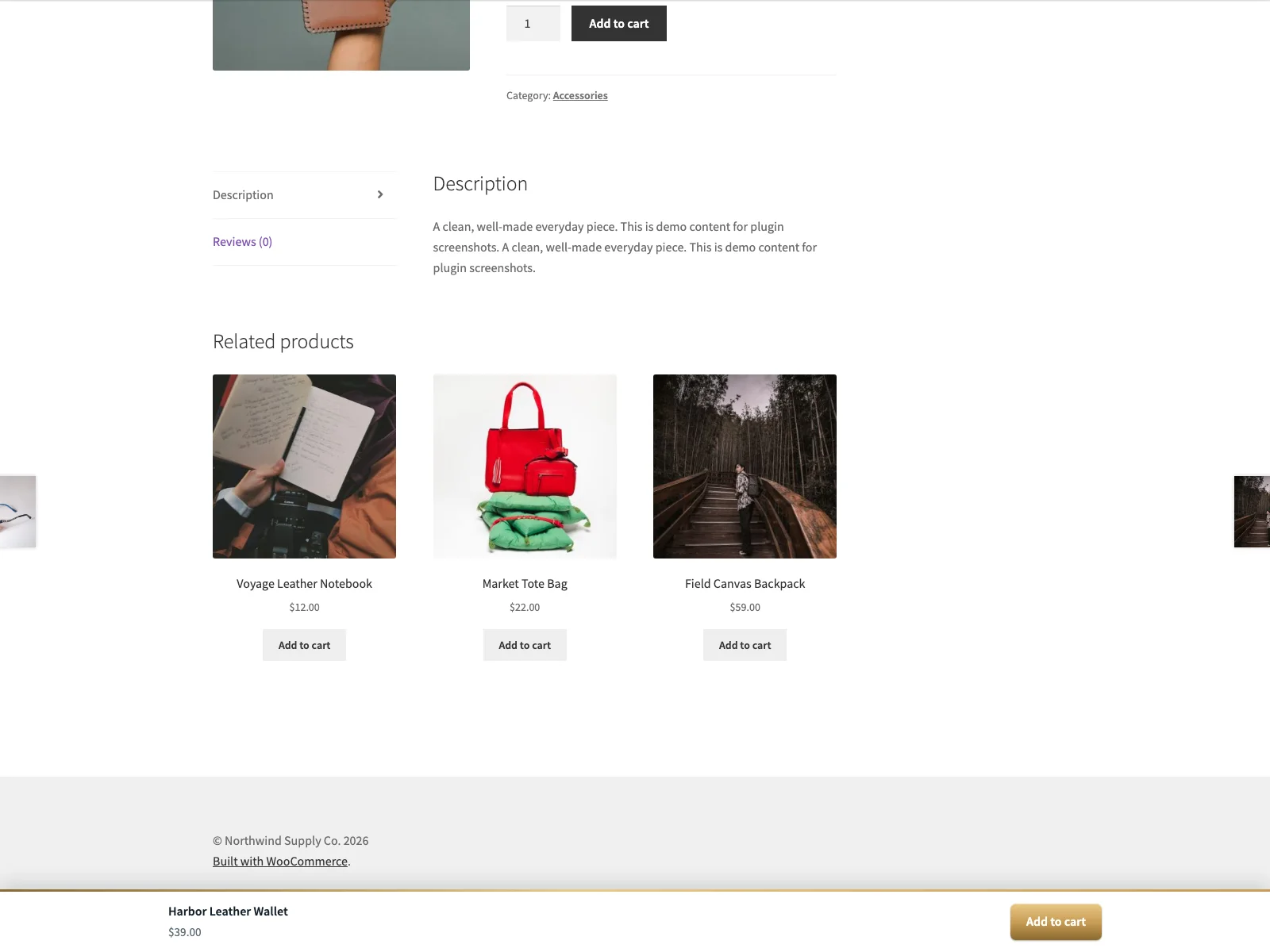 The storefront sticky bar stays pinned to the bottom of the window with the price and buy button in reach.
The whole plugin is built to stay out of the way. The bar is positioned with CSS position: fixed and starts hidden, so it sits outside the document flow and does not push other content around or cause layout shift when it appears. Its stylesheet and script load only on single product pages, and the script is deferred, so the performance cost is confined to the pages where the bar is actually used.
On variable products the bar follows WooCommerce’s native variations form. As the shopper picks options, the price, the stock status and the buy button update to match the selected variation. Until a variation is chosen, the bar shows a “Choose options” button that scrolls back to the selectors rather than letting the shopper add nothing to the cart. Anchor does not load its own copy of jQuery to do this; it listens to the variation events WooCommerce already fires, which keeps the script small and avoids fighting with the theme.
Note: On variable products the bar listens to WooCommerce’s native variation events rather than loading its own jQuery, so the price, stock and button track the selected variation without a stale “from” price.
The bar ships as an accessible surface. It is marked up as an ARIA region with a screen-reader label and a visible focus state, it honours the prefers-reduced-motion preference, and it includes a dark-mode style so it fits a dark theme without extra work. Anchor declares HPOS and cart and checkout blocks compatibility, so it sits cleanly on a modern WooCommerce install.
On the data side, Anchor connects to no external services. It sends no data off your site and loads nothing from a third-party CDN; its stylesheet and script are served from your own install, and the front-end script reads only a small inline config object carrying the scroll threshold. It stores just two autoload-off options, the enable toggle with the threshold and a database version, keeps no per-product data, and removes both options when you delete the plugin. It sends no email and makes no HTTP requests of its own.
Setting it up
Getting the bar live takes a couple of minutes.
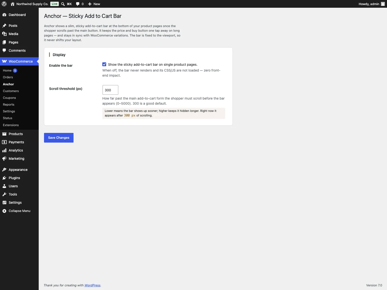 The plugin settings screen, where you enable the bar and set the scroll threshold in pixels.
- Install and activate Anchor. Install from Plugins > Add New, or upload it to
/wp-content/plugins/plogins-anchor. WooCommerce must be installed and active first, since the bar reads the product’s price, stock and add-to-cart form from WooCommerce itself. - Enable the bar. Go to WooCommerce > Anchor and turn the bar on.
- Set the scroll threshold. On the same screen, set how far down the page (in pixels, 0 to 5000) the bar should appear. A common choice is to reveal it once the shopper has scrolled past the main add-to-cart button.
- Check it on a real product. View a long product page on desktop and on a phone, scroll down, and confirm the bar slides in with the correct title, price and button.
- Test a variable product. Pick different options and confirm the bar’s price, availability and button update to match the selected variation, and that “Choose options” scrolls you back up before any variation is set.
Practical tips
A sticky bar is a small feature, but a few decisions make it feel right rather than nagging.
- Tune the threshold to your template. The default is fine, but the ideal value is “just after the main button leaves view.” If your add-to-cart area sits high on the page, a smaller threshold reveals the bar sooner; on a tall hero, a larger one avoids showing it while the main button is still visible.
Tip: Aim the scroll threshold at “just after the main button leaves view” so the bar only fills in for the control that has left the screen, rather than doubling up while the main button is still visible.
- Do not double up on calls to action. The sticky bar is the secondary copy of the buy button. Resist adding a second floating widget, a chat bubble and a coupon popup to the same corner of the screen; on mobile they compete for the same few pixels and the bar loses.
Warning: On mobile a chat bubble, coupon popup and the sticky bar all compete for the same few pixels. Piling extra floating widgets into that corner is where the bar loses.
- Check it against a sticky theme header. Some themes pin a header to the top of the viewport. The bar sits at the bottom, so they rarely clash, but it is worth a quick look on mobile, where vertical space is tight.
- Respect out-of-stock states. Anchor shows the appropriate text and link for products that are not purchasable, so the bar does not promise a purchase that cannot complete. Spot-check an out-of-stock product to confirm the bar reads the way you expect.
- Write the button text once, in WooCommerce. Simple products use WooCommerce’s own add-to-cart text, so changing it there keeps the main form and the bar in step.
Anchor versus default WooCommerce
WooCommerce renders a perfectly good add-to-cart form, but it lives in one place on the page and scrolls away with everything else. Here is the difference for the sticky-bar feature specifically.
| Capability | Default WooCommerce | Anchor |
|---|---|---|
| Buy button after scrolling past the main form | Gone until you scroll back | Sticky bar pinned to the viewport |
| Configurable reveal point | None | Scroll threshold in pixels (0 to 5000) |
| Variation price and stock sync in the bar | n/a | Tracks the native variations form |
| Layout shift when the bar appears | n/a | None; fixed and hidden until needed |
| Asset loading | n/a | Only on single product pages, script deferred |
| Accessibility of the bar | n/a | ARIA region, focus state, reduced-motion support |
| Dark-mode style | Theme-dependent | Built-in dark-mode style |
| External services | None | None; nothing leaves your site |
| Cost | Free (no sticky bar) | Free; PRO adds appearance, placement, scheduling and analytics |
Free versus PRO
The free edition is a complete sticky bar, not a teaser: the bar itself, the configurable scroll threshold, the variation-aware price and stock sync, the accessibility markup and the dark-mode style are all included, and the bar connects to nothing external. Anchor Pro is an add-on that requires the free plugin and builds on it for stores that want more control. It adds a custom colour for the buy button and a custom button label such as “Buy now”, placement rules to show the bar only on selected products or hide it on specific products and categories, campaign scheduling so the bar appears only during a start and end window, and per-product conversion analytics that count bar views, button taps and add-to-cart actions. The PRO controls live in the same WooCommerce > Anchor screen, with analytics on WooCommerce > Anchor Analytics. If you only need the bar, the free version is the whole feature.
The short version
On a long WooCommerce product page the buy button scrolls away first, so the shopper who has just decided to purchase has to scroll back to act on it. A sticky add-to-cart bar removes that step by keeping the price and button pinned to the viewport. A good one appears only after the main button leaves the screen, tracks variations, loads only where it is needed and never shifts the layout. The free Anchor plugin does exactly that, with a scroll threshold you set, variation sync, accessible markup and no external calls; Anchor Pro adds custom appearance, placement rules, scheduling and conversion analytics when you want to go further.