WooCommerce variation swatches: colours and labels
By Mariusz Szatkowski · Updated: 2026-09-11
A shopper choosing a colour or a size on a WooCommerce product page meets the same control for both: a dropdown. It works, but it hides the very thing the shopper is trying to compare. A colour becomes a word in a list, and a size sits behind a click that has to be opened before any option can be read. Swatches turn that choice into something visible and clickable. This guide explains what variation swatches are, why dropdowns slow the decision, what a swatch plugin actually needs to get right, and how the free Swatch plugin adds them without dragging your store down.
What variation swatches are
A WooCommerce variable product is built from attributes. A t-shirt has a colour attribute and a size attribute; a phone case has a colour and a model. Each attribute is shown on the product page as a <select> dropdown by default, and the shopper picks one option from each to land on a specific variation with its own price, stock and image. That model is sound. The problem is purely how the choice is presented.
A dropdown forces the shopper to do three things in sequence: open the list, read the option names, and pick one before they can see the rest. For a size that is mildly annoying. For a colour it is genuinely unhelpful, because a colour rendered as the word “Sapphire” or “Forest” tells the shopper nothing about what the product looks like. They are choosing blind and hoping the name matches the picture.
Variation swatches replace those dropdowns with visual controls:
- Colour dots for a colour attribute, so the shopper sees the actual colour rather than its name.
- Button or label pills for sizes and other attributes, so every option is visible at once and one tap selects it.
Nothing is hidden behind a click. The shopper scans the row, sees what is available, and picks. The decision gets faster, and the store looks closer to the larger retailers shoppers already compare it against, where swatches are the norm rather than the exception.
Why dropdowns slow the decision
The cost of a variation dropdown is small per interaction and large in aggregate. Every extra step between landing on a product and being able to add it to the cart is a chance to hesitate, and hesitation on a product page is where conversions quietly leak away.
Three things go wrong specifically with dropdowns. First, options are hidden until opened, so the shopper cannot see at a glance how many colours or sizes exist, or whether the one they want is even offered. Second, a colour shown as text is ambiguous, so the shopper either guesses or scrolls back to the gallery to cross-reference, which breaks their flow. Third, on a phone a native select opens a separate picker overlay, which is more friction than tapping a visible swatch in place.
None of this means dropdowns are broken. It means they are the wrong tool for attributes a shopper wants to see. Colour is the obvious case, but the same logic applies to anything where laying the options out flat is clearer than nesting them in a menu.
What a good swatch plugin needs
Swatches are easy to add badly. Plenty of plugins paint pretty controls over the top of WooCommerce and create more problems than they solve. Three things separate a swatch plugin you can trust from one that bites you later. Use them as a checklist whether you build, buy or install.
- It drives the native variations form. The swatch should be an input into WooCommerce’s own variation logic, not a parallel system bolted on beside it. When the swatch feeds the real form, price, stock status, the gallery image and the add-to-cart button all update through WooCommerce’s tested code path. When it does not, those things drift out of sync and you get the classic bugs: a price that does not match the selection, an add-to-cart button that stays disabled, stock that lies.
Warning: A swatch that runs as a parallel system instead of feeding WooCommerce’s own variation form drifts out of sync, producing the classic bugs: a price that does not match the selection, a disabled add-to-cart button, and stock that lies.
- It does not slow the store. Many swatch plugins load jQuery and a stack of extra libraries on every page, whether or not a product needs them. A small script hooked into WooCommerce’s existing variation events does the same job without the weight, and ideally loads nothing at all on pages that have no swatches to render.
- It is accessible. Swatches built as unlabelled clickable
<div>s lock out keyboard and screen-reader users entirely, and turn what was a perfectly accessible native select into a control nobody using assistive technology can operate. Proper radiogroup semantics, arrow-key navigation, visible focus and screen-reader labels keep the control usable for everyone, which is both the right thing to do and increasingly a legal expectation.
A fourth, quieter requirement: graceful degradation. A swatch plugin should never break a product page just because an attribute has not been fully configured. An attribute with no colours assigned should simply keep its dropdown, so you can roll swatches out one attribute at a time without risk.
How Swatch does it
Swatch for WooCommerce is a free, open-source plugin that replaces variation dropdowns with visual swatches on single product pages, built around exactly the points above. It is deliberately focused: it does the swatch job well rather than bundling a dozen unrelated features.
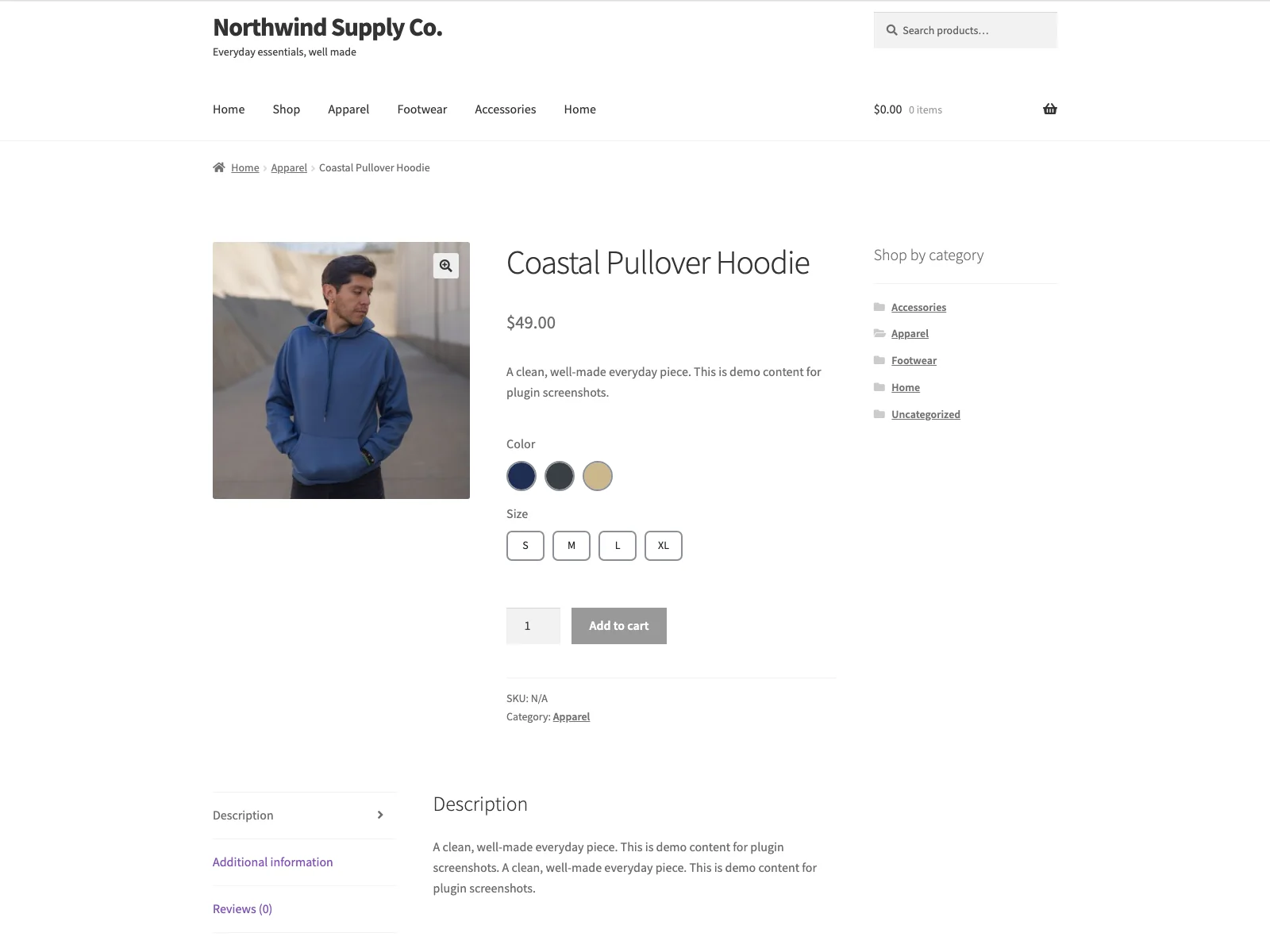 Swatch turns the colour and size dropdowns into visible, clickable controls on the product page.
- Two swatch types. Colour dots and button or label pills. You choose the type independently for each attribute, so colour can render as dots while size renders as pills, all on the same product.
- Colour and label per term. You set a colour on each term, sanitised with
sanitize_hex_color, or a custom label stored as term meta. A button label defaults to the term name, so you only set a custom label when you want something shorter than the full attribute value. - Native variations form. The swatches feed WooCommerce’s own variations form, so price, stock and the add-to-cart button update just as they do with dropdowns. Selected and out-of-combination states are reflected automatically, so a shopper who picks a colour that has no matching size sees that combination handled the same way WooCommerce already handles it.
- Keyboard operable. Radiogroup semantics and arrow-key navigation, with screen-reader labels, so the swatch behaves like a native radio group.
- Accessible visuals. Focus-visible rings, sufficient contrast and reduced-motion support, with no layout shift when the swatches render.
- Graceful fallback. An attribute with no swatch data keeps the standard dropdown, so nothing ever breaks while you configure things.
- Plain JavaScript. The front end hooks WooCommerce’s variation events with no jQuery dependency, and when swatches are disabled no swatch styles or scripts load at all.
It is self-contained: no external services, no account, no API key, no remote scripts, fonts or CDN assets, and no telemetry. Everything lives in your own database. The swatch type per attribute and the global defaults are stored in plugin options, and each term’s colour and label are stored as swatch_color and swatch_label term meta on your existing WooCommerce attribute terms.
Setting it up
Getting swatches live takes a few minutes:
- Install the plugin from Plugins > Add New, or upload it to
/wp-content/plugins/plogins-swatch. WooCommerce must be installed and active. - Activate it. Swatches work out of the box, so a button-style swatch already renders on your variable products at this point.
- Go to WooCommerce > Swatch to set the global defaults: whether swatches are enabled, and the default swatch type (button or colour) for any attribute you have not given its own type.
- On Products > Attributes, open an attribute and set its Swatch type if you want to override the default. For colour swatches, open each of that attribute’s terms and set a Swatch colour; for button swatches, optionally set a short Swatch label per term.
The settings screen carries inline help under every field and a small preview of the two swatch styles, so you are not cross-referencing documentation while you configure it. Because the colours and labels live with each attribute rather than on a central settings page, they stay correct as your catalogue grows. Configuration is gated to the manage_woocommerce capability, so shop managers can set swatches up without full administrator access.
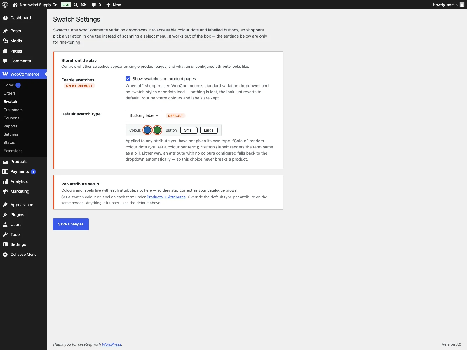 In wp-admin you pick the swatch type per attribute and set a colour for each term.
Practical tips
A plugin gives you the mechanism; a few habits make the result better.
- Use colour swatches only for colour. Colour dots earn their place when the option is a colour a shopper wants to see. For sizes, materials or capacities, button pills are clearer, because a coloured dot for “Large” communicates nothing. Mixing the two types per attribute is exactly what the per-attribute type setting is for.
Tip: Reserve colour dots for colour attributes. A coloured dot for “Large” communicates nothing, so use button or label pills for sizes, materials and capacities instead.
- Set real colours, not approximations. A “Navy” swatch that renders as pure blue undersells the product and risks a return when the item arrives darker than the dot suggested. Pull the hex value from the product photography where you can, so the swatch matches what the shopper will actually receive.
- Keep labels short. Button swatches read best when the label is one or two words. If your attribute terms are long, set a concise custom label per term rather than letting the full term name wrap awkwardly.
- Roll out one attribute at a time. Because unconfigured attributes fall back to the dropdown, you can convert your highest-traffic products’ colour attribute first, confirm it looks right, and expand from there without ever risking a broken page.
Note: An attribute with no swatch data keeps its standard dropdown, so you can convert swatches one attribute at a time without ever risking a broken product page.
- Mind contrast on near-white and near-black colours. A white swatch on a white background disappears. Accessible swatch styling helps, but it is worth eyeballing your lightest and darkest terms to be sure the dot is still visible.
Swatch versus default WooCommerce
WooCommerce shows every variation attribute as a dropdown out of the box. Here is the difference for the variation choice specifically:
| Capability | Default WooCommerce | Swatch |
|---|---|---|
| Colour attribute display | Dropdown of names | Colour dots |
| Size and other attributes | Dropdown of names | Button or label pills |
| Swatch type per attribute | n/a | Chosen independently per attribute |
| Price, stock, add-to-cart | Native form | Drives the same native form |
| Out-of-combination states | Native handling | Reflected automatically |
| Keyboard and screen-reader | Native select | Radiogroup, arrow keys, labels |
| jQuery dependency | n/a | None, plain JavaScript |
| Unconfigured attribute | Dropdown | Falls back to the dropdown |
| Cost | Free (core) | Free; PRO adds image swatches, galleries, archive previews |
Free versus PRO
The free edition covers colour and button or label swatches in full: the two swatch types, the per-attribute type selection, a colour or label per term, the native form wiring, accessibility and the graceful dropdown fallback. It is a complete swatch tool for single product pages, not a teaser.
Swatch PRO builds on top for stores that want swatches to do more. Image swatches per term, per-variation gallery images so the gallery swaps with the selection, swatches on shop and category loops so shoppers can pick a colour before they open the product, hover tooltips, and custom swatch sizes and shapes are part of PRO. The free plugin exposes filters that PRO and other add-ons hook into, so the upgrade path is additive rather than a rebuild.
The short version
Variation swatches make a WooCommerce product page easier to read by turning colour and size dropdowns into visible, clickable controls, which speeds up the decision and removes the guesswork of choosing a colour by name. The ones worth using still drive WooCommerce’s native variations form, avoid jQuery, fall back to the dropdown when an attribute is unconfigured, and stay keyboard and screen-reader accessible. Swatch for WooCommerce does all of that for free with colour and label swatches, works out of the box, and leaves image swatches, gallery previews and archive swatches to PRO when you are ready for them.