WooCommerce product comparison: side-by-side tables
By Mariusz Szatkowski · Updated: 2026-09-11
A shopper deciding between three similar products faces a small but real friction. They have to hold prices, specs and stock levels in their head while clicking back and forth between pages, or open a tab for each candidate and squint across them. Either way the comparison happens off your store, in working memory or in a sprawl of browser tabs, and that is exactly where considered purchases quietly stall. Product comparison removes the friction by putting the candidates in one table, side by side, on the page where the add-to-cart button already lives. This guide explains what WooCommerce product comparison is, why it matters for considered purchases, what a good compare tool actually needs, and how the free Versus plugin adds one.
What product comparison is
Product comparison is a feature that lets a shopper collect several products and view them together in a single side-by-side table. Instead of opening each product in its own tab and comparing prices, attributes and availability by eye, the shopper sees every candidate lined up in columns, with one row per piece of information: the image, the name, the price, the SKU, whether it is in stock, a short description, and a row for each product attribute such as colour, size or material.
The format does something a product page on its own cannot. A product page is good at selling one product, but poor at answering the question a comparison shopper is actually asking, which is not “is this good?” but “which of these is right for me?” A comparison table reframes the page around that question: the rows that matter sit next to each other, the values differ visibly from column to column, and the choice becomes a scan rather than a memory exercise.
Why it matters
Comparison matters most for considered purchases: electronics, tools, appliances, anything with specifications that decide the choice rather than taste alone. For an impulse buy the shopper does not compare; they add to cart. For a considered buy they always compare, and the only question is where. If your store does not offer a way to do it, they do it somewhere you cannot influence: across tabs, in a spreadsheet, on a competitor’s site that does have a compare table, or in their head while they drift away.
Keeping the comparison on your store has three effects. The decision stays on the page, so the add-to-cart button is one click away the moment the shopper makes up their mind. The differences are presented in your framing, with the rows you choose to show. And the friction of comparing drops far enough that more shoppers finish the comparison instead of abandoning it half-built. None of that requires discounting or persuasion; it just removes the busywork between “interested in a few” and “decided on one.”
Note: If your store offers no way to compare, shoppers do it somewhere you cannot influence: across tabs, in a spreadsheet, or on a competitor’s site that does have a compare table.
What a good comparison tool needs
Not every compare tool is built the same, and a careless one can cost more than it returns. Use this as a checklist whether you build, buy or install:
- A clear side-by-side table. Image, name, price, SKU, availability and a short description, plus a row for each product attribute, so the differences are obvious at a glance and nothing important is buried.
- Difference highlighting. Rows whose values differ should stand out, ideally with a toggle that hides everything the products share so only the deciding factors remain on screen.
- A sensible product cap. A table that grows without limit becomes unreadable on a phone. A configurable cap keeps the columns scannable.
- Guest and customer support. Logged-out visitors should be able to build a comparison too, and that list should follow them into their account when they log in rather than vanishing.
- No performance tax. Comparison should not load heavy JavaScript on every shop listing. Vanilla JavaScript with no jQuery dependency, loaded only where it is needed, keeps the shop fast.
- Accessibility. The compare controls should be real buttons with proper state, keyboard operable, with changes announced to assistive technology rather than happening silently.
- Data that stays put. The comparison is product data from your own catalogue. It has no business being shipped to a third-party server.
Notice what is not on that list: cleverness. A comparison table does not need animation or gimmicks. It needs to be correct, fast and readable, and to get out of the way once the shopper has decided.
How Versus does it
Versus for WooCommerce is a free, open-source (GPLv2) comparison plugin built around exactly those properties. It adds a Compare button to your WooCommerce shop and archive loops and to the single product page, and shoppers build a side-by-side comparison table from there, with all the product data kept inside your store.
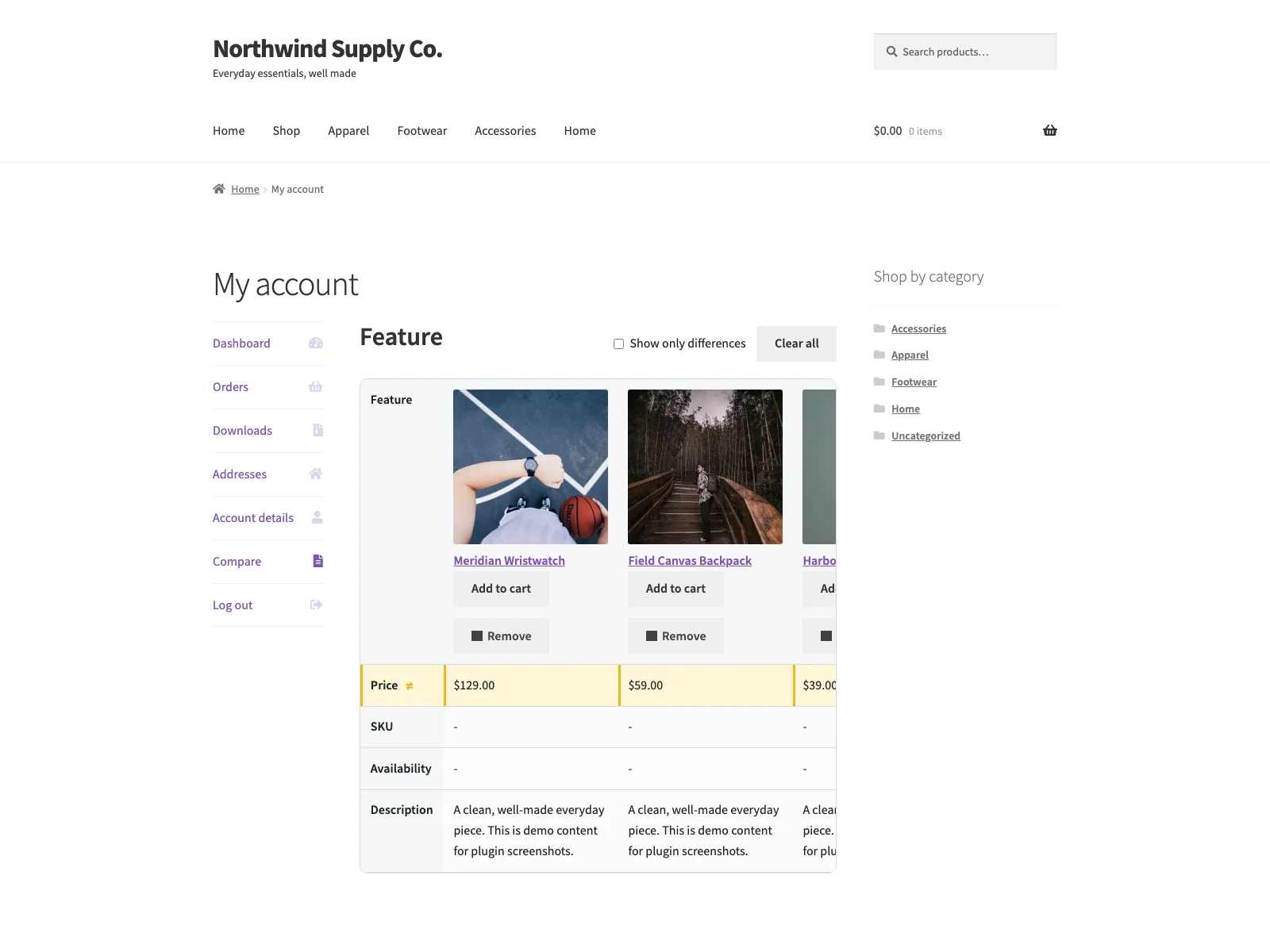 The storefront comparison table places candidate products in columns so shoppers can scan the differences at a glance.
The table shows the product image, name, price, SKU, availability and short description, plus a row for every product attribute such as colour, size or material. Rows whose values differ between products are highlighted, and a single toggle hides everything that is identical so the real differences stand out. The comparison itself opens on the My Account “Compare” tab for logged-in customers, or at a dedicated compare URL for guests.
Guests and customers
A logged-out visitor builds a comparison stored in a first-party cookie in their own browser, kept for six months, so they can leave and come back without losing their shortlist. A logged-in customer gets a “Compare” tab in My Account. When a guest logs in, the guest list is merged into the account, so a comparison started before sign-in is not thrown away at the door. Guest comparison can be switched off entirely if you only want it for account holders.
Note: When a guest logs in, their list is merged into the account, so a comparison started before sign-in is not thrown away at the door.
Built for speed and accessibility
The plugin’s own front-end script is vanilla JavaScript with no jQuery dependency, deferred and loaded in the footer, and the CSS and JavaScript are enqueued only on pages that actually show the compare button or the table. That means comparison does not pull a script library onto every page of the shop. The comparison table scrolls horizontally inside its own wrapper, so adding columns never reflows the page and never causes layout shift. The compare controls are real buttons with an aria-pressed state that updates over AJAX, there is a polite live region that announces comparison changes to screen readers, and the buttons are fully keyboard operable with visible focus styles.
Adding or removing a product is a single nonce-verified AJAX request to your own site, with no full page reload. The build also handles the unglamorous cases: it guards against double submission, refreshes the table automatically after a remove, degrades gracefully on a network failure, and shows friendly fallbacks for missing data.
Setting it up
Getting comparison live takes a few minutes:
- Install Versus from Plugins > Add New, or upload it to
/wp-content/plugins/plogins-versus. WooCommerce must be installed and active. - Activate it.
- Open the Versus menu in wp-admin to choose the compared fields and where the button appears.
- That is it. The Compare button now appears on your shop and product pages, and shoppers can open the comparison from there.
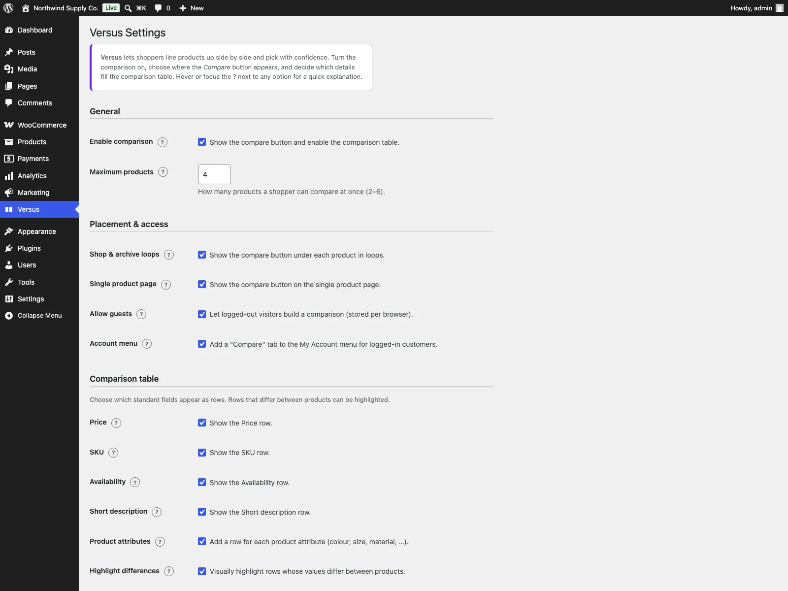 The wp-admin Versus settings screen, where you pick the compared fields, button placements and the 2 to 6 product cap.
The settings page runs on a WooCommerce capability and carries an inline “?” help affordance, wired through aria-describedby, on every setting, so you are not cross-referencing documentation while you configure it. From there you can:
- Enable or disable comparison and set how many products can be compared at once, between 2 and 6.
- Choose where the Compare button appears, on loops and on the single product page, and whether guests can use it.
- Choose which standard fields appear as rows, price, SKU, availability and short description, and whether to include product attributes.
- Toggle difference highlighting, set the differences-only view as the default, and control the image, add-to-cart and remove controls in each column header.
- Customise the front-end strings, the compare button, the remove button, the compare link, the differences toggle, the clear-all button and the empty-list message, or leave them on their translated defaults.
All strings are translatable through the versus text domain, and a versus.pot template ships in /languages. The table itself is themeable through CSS custom properties, with fluid sizing, dark-mode and reduced-motion support, and a friendly empty state when nothing has been added yet. Deleting the plugin removes its options and drops the comparison table cleanly.
Where your data lives
Versus makes no outbound HTTP request and bundles no SDK, web font, CDN asset or analytics call. Compared product IDs live in a custom table in your own database, the settings live in a WordPress option, and a guest’s selection is kept in that first-party cookie in their own browser. Adding or removing a product is a same-origin AJAX call to your own admin-ajax.php. For a feature that touches every product in the catalogue, keeping the data on your own site rather than a third-party server is the right default.
Practical tips for a comparison that converts
The plugin gives you the mechanism; a few choices make it pull its weight:
- Keep the cap low for products with many attributes. Six columns is fine on a desktop but cramped on a phone. A cap of three or four keeps each column wide enough to read.
Tip: For closely matched products, the differences-only view is the single most useful setting: it lands the shopper on what changes between the products rather than the rows identical across all of them.
- Show only the rows that decide the purchase. Every row is one more thing to scan. Price, availability and the two or three attributes that actually differentiate the products usually do more work than every attribute you have ever defined.
- Lean on difference highlighting. The differences-only default means the shopper lands on what changes between the products, not the rows identical across all of them. For closely matched products this is the single most useful setting.
- Clean your attributes first. A comparison table is only as good as the product data behind it. Inconsistent attribute names or missing values show up immediately as gaps, so it is worth tidying attributes before you turn comparison on.
Warning: A comparison table is only as good as the product data behind it. Inconsistent attribute names or missing values show up immediately as gaps, so tidy your attributes before you turn comparison on.
- Point shoppers to it. A short line on category pages, “Compare these side by side,” turns the Compare button into an obvious next step rather than a control people never notice.
Versus versus default WooCommerce
WooCommerce has no built-in product comparison at all. Here is the difference for comparison specifically:
| Capability | Default WooCommerce | Versus |
|---|---|---|
| Side-by-side compare table | None built in | Image, price, SKU, availability, short description, attributes |
| Difference highlighting | None | Yes, with a differences-only toggle and optional default |
| Compare button placements | None | Shop and archive loops and the single product page, each toggled |
| Guest comparison lists | None | Yes, first-party cookie for six months, merged on login |
| Customer comparison list | None | A Compare tab in My Account |
| Product cap | None | Configurable 2 to 6 |
| Configurable rows and labels | None | Choose fields and customise every front-end string |
| Front-end dependency | jQuery in many themes | Vanilla JavaScript, no jQuery, deferred, loaded only where needed |
| Accessibility | n/a | Real buttons, aria-pressed, live region, keyboard operable |
| External calls | n/a | None; data stays in your own database |
| Cost | Free (core has none) | Free; PRO adds shortcode, sticky bar, export, category compare |
Free versus PRO
The free edition is a complete comparison feature, not a teaser: the Compare button, the side-by-side table, difference highlighting, guest and customer lists, the 2 to 6 cap, configurable fields and customisable labels are all included. Versus Pro is an add-on for stores that want more control over how and where the comparison appears. It requires the free Versus plugin to be installed and active, and is distributed through Freemius rather than the WordPress.org directory.
PRO adds a [versus_compare] page shortcode that renders the shopper’s current comparison as a full table with expanded rows, including weight and dimensions alongside price, SKU, stock, description and attributes, fed directly by the free plugin’s Compare buttons. It adds configurable comparison rows under Products > Versus Pro, a sticky compare bar that floats at the bottom of shop, category and product pages and links straight to the comparison, CSV, PDF and print export of the table, and category-scoped compare that restricts a comparison to products sharing a WooCommerce product category so shoppers only line up like for like. Those features are PRO-only and build on the free foundation.
The short version
Product comparison turns a multi-tab, by-hand chore into one side-by-side table on your store, which keeps considered purchases from drifting somewhere you cannot influence. A good compare tool needs a clear table, difference highlighting, a sensible cap, guest and customer support, accessibility, and no performance tax, with the data staying on your own site. The free Versus plugin delivers all of that: a vanilla-JavaScript compare button and table that loads only where it is needed, highlights what differs, works for guests and customers alike, and keeps every product ID in your own database. PRO adds a comparison-page shortcode, a sticky bar, export and category-scoped compare when you want to take it further.